Megan Greene
“....I want my drawings to feel short of convincing, for the viewer to be unable to quite locate herself, be it above or below ground, on land or in space...."
Megan Greene (b. 1976, Buffalo, NY) is based in Oak Park, IL. Greene received her BFA from the University of Notre Dame, and her MFA from Rutgers, State University of New Jersey. Exhibitions include Regards, Chicago; Hyde Park Art Center, Chicago; Buffalo AKG Art Museum, Buffalo; Kinz Tillou, New York; Katharine Mulherin, Toronto; and Loudhailer, Los Angeles. She is represented by Regards in Chicago where her current show, Ides, runs through May 17th
MEPAINTSME: Tell us a little bit about yourself and your background in the arts.
MEGAN GREENE: I live with my husband and twelve-year-old twin daughters. I’m a homebody. I cook, I take walks. I read. Contemporary fiction and news mostly. My husband is a designer/illustrator and all-around curious guy. An excellent day includes chats with him.
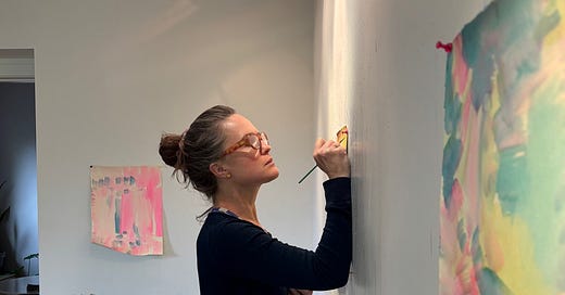
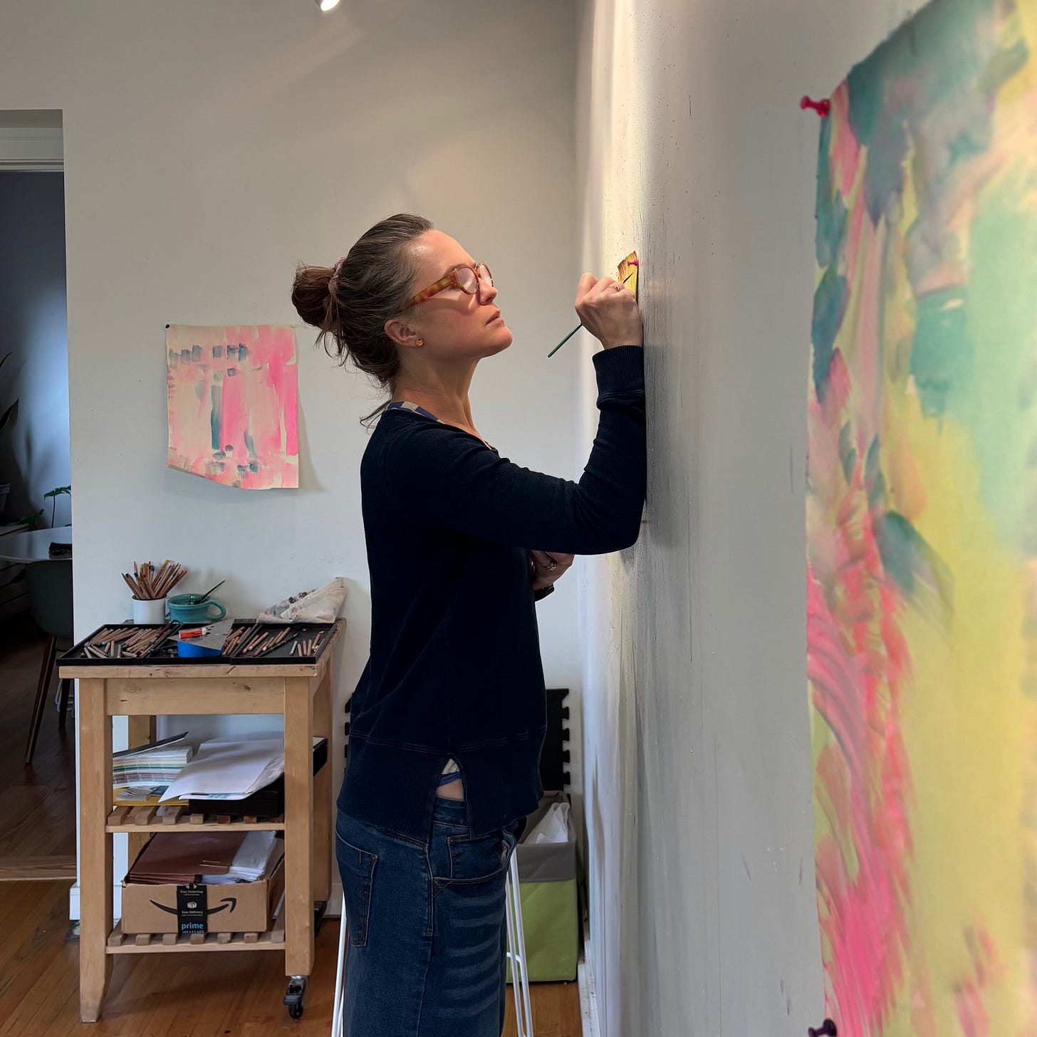
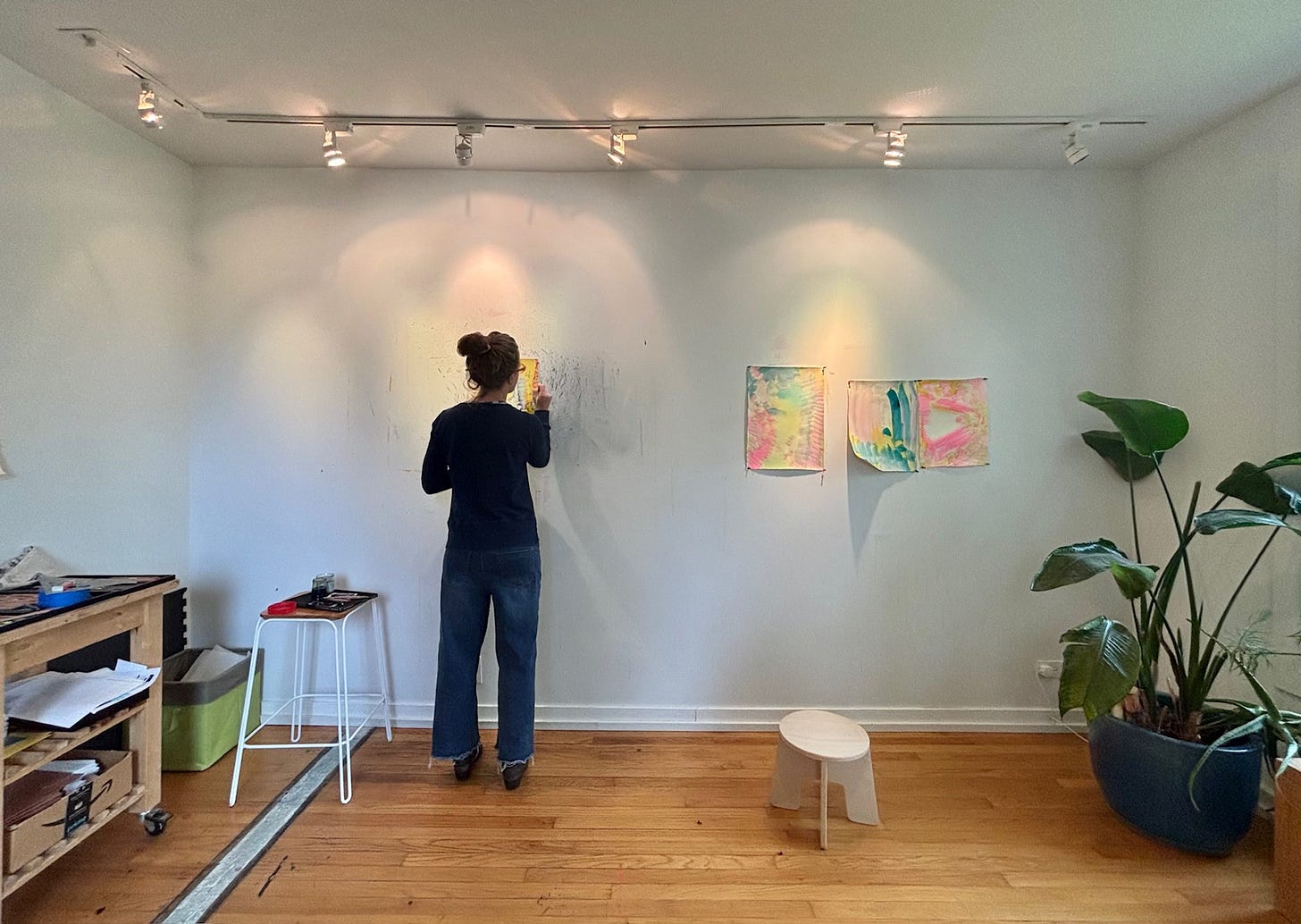
My studio has always been at home, which suits me, and was particularly helpful when my girls were young. I draw everyday, or nearly. I listen to podcasts while I work. I've made art forever, and drawings in particular for the last twenty odd years. Also, I paint murals for income.
MPM: When I first came upon your work I felt like I was experiencing a sensation of being underwater in the ocean, with light beams breaking through and underwater plant life flowing — or at least dreaming of being underwater. I feel like in your current show Megan Greene: Ides at Regards Gallery I’ve now found myself above water in the middle of apocalyptic storms and raging hurricanes! Do you feel there has been a change in your work in this regard? If so, can you talk a bit about how your work has evolved in the last couple of years to your current body?
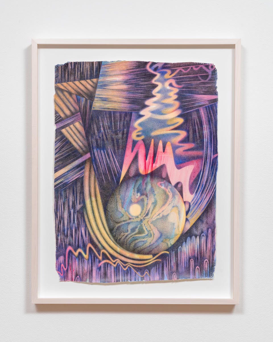
MG: I like your descriptions there. And yes, I agree there has been a change. My work from a few years ago—e.g. from my 2022 show at Regards—felt more staged, in a way that I liked and intended. There was a clear sense of figure/ground, distinct references to flora, and a precision both in rendering and composition. There was a stillness, I think, in part, because I use colored pencil in a fairly soft and seamless manner.
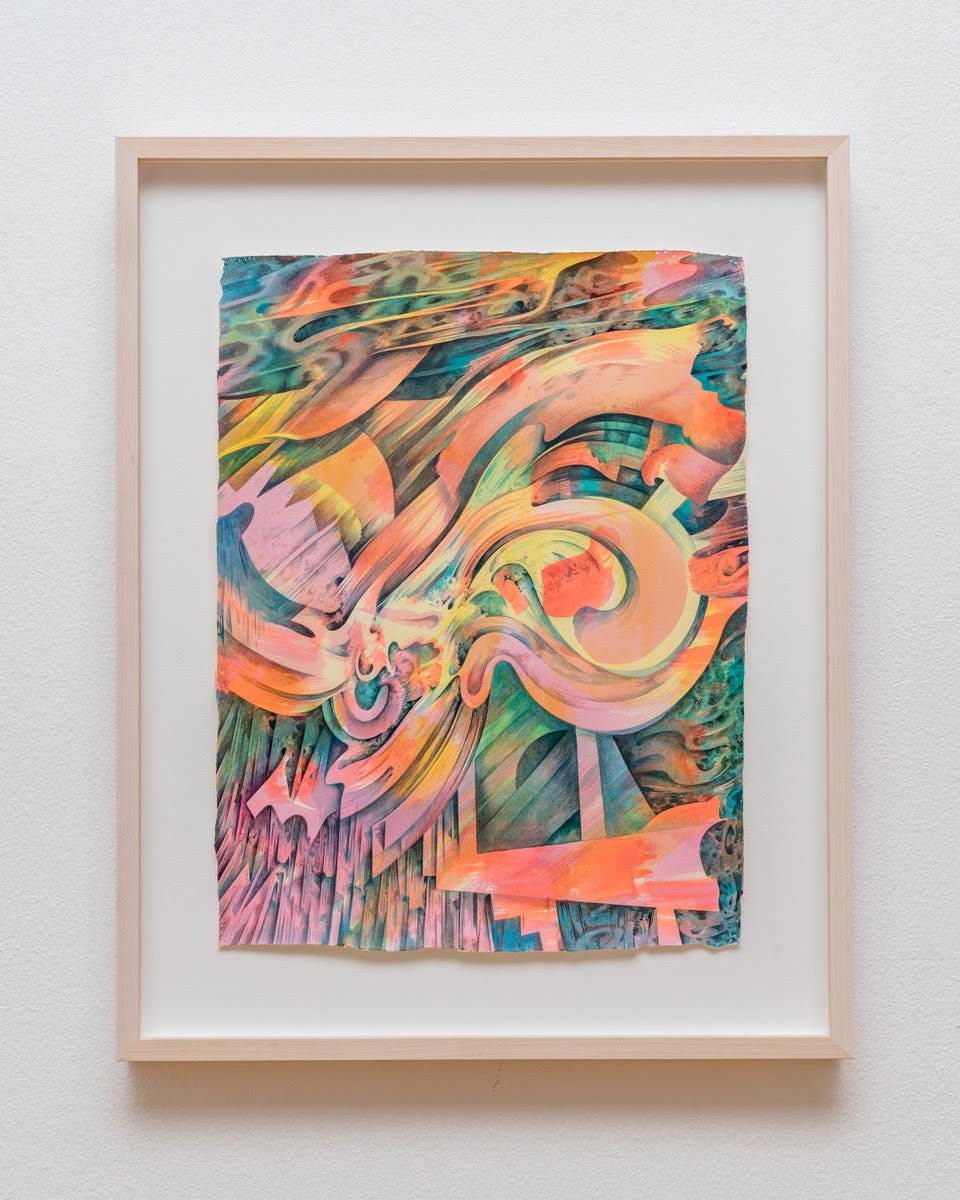
In the time since, I’ve tried to mix up the way I use ink. More of it, looser. That has led to some pictorial shifts. I’ve played around with a more collapsed picture plane (in some pieces, not all) and find myself creating more dynamic compositions. As you say, many of my recent drawings have sort of a cataclysmic quality (just without the devastation).
MPM: I find your work to be in the tradition of early 20th century American Visionary artists such as Arthur Dove, Emil Bistramm and Agnes Pelton. Do you see your work communicating in a similar way as these types of artists? How would you say your work differs?
MG: Yes, though to be honest, I don’t think about landscape very much! I mean, I do, just less than you might think.
To clarify: my work is strongly organic. The forms, the textures I'm drawn to—it's born of stuff that grows. Also, the sort of mediated, atmospheric spaces I create are reminiscent of the artists you mentioned. (I’d add Charles Burchfield to that list. Being from Buffalo, I’ve known and loved his work since I was a kid.)
However, I’m not particularly interested in depicting landscape, nor in using it symbolically, as Pelton and Burchfield did. Rather, I want my drawings to feel short of convincing, for the viewer to be unable to quite locate herself, be it above or below ground, on land or in space, etc. I’m attached to that degree of abstraction. Oh, that’s a tree, that’s a flower—I'm trying to work just short of that.
MPM: . Your work is primarily executed with colored pencil, yet I’ve also recently seen more of an openness and transparency to the work that reveals a directional energy generated by a brush. Is this accurate? Can you walk us through your process and how a piece develops?
MG: You’re right, I’ve changed it up a bit. A few years ago, I was only using ink as a ground. As I mentioned, I’ve tried to push it further recently, either on its own or in conversation with the colored pencil.
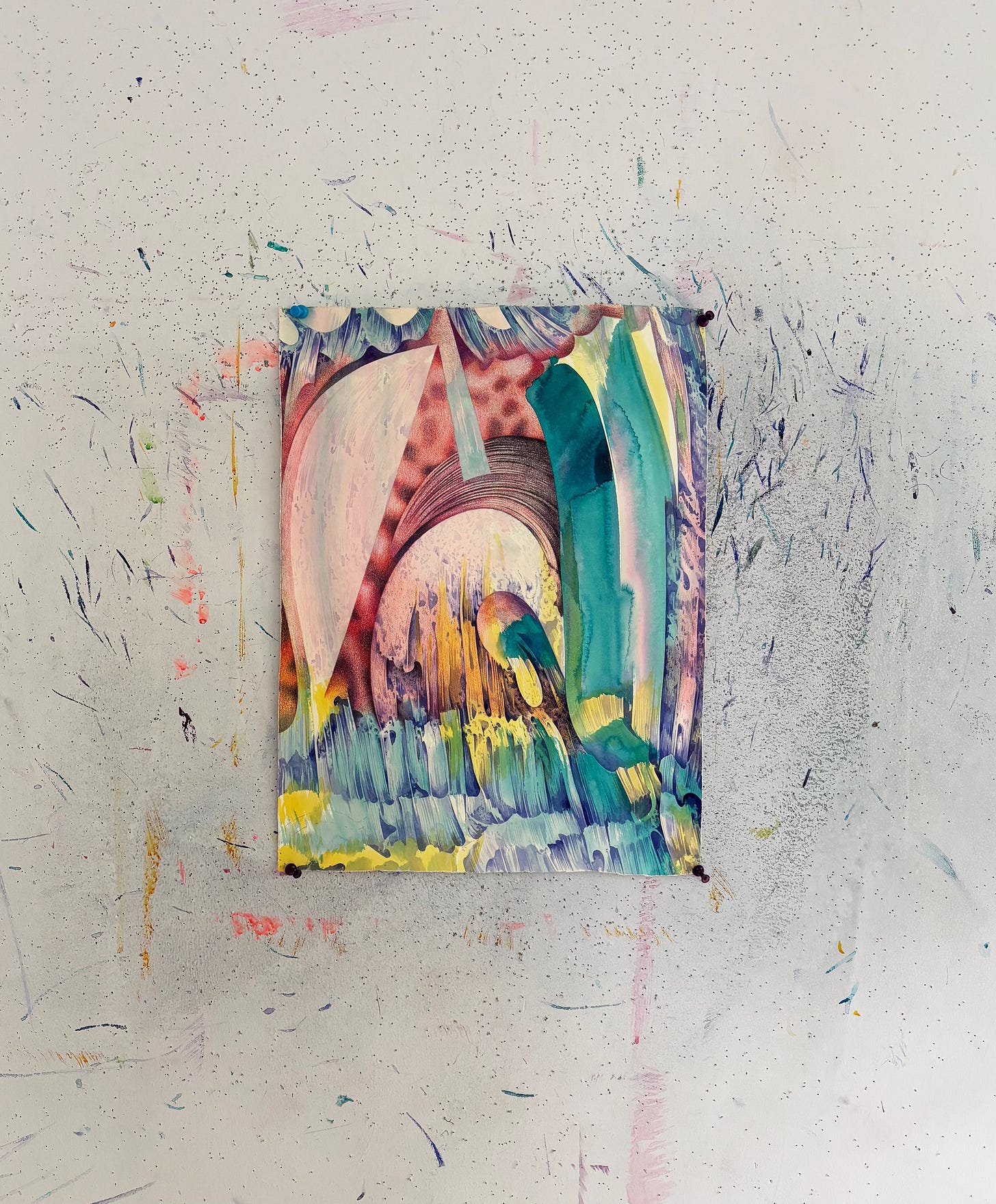
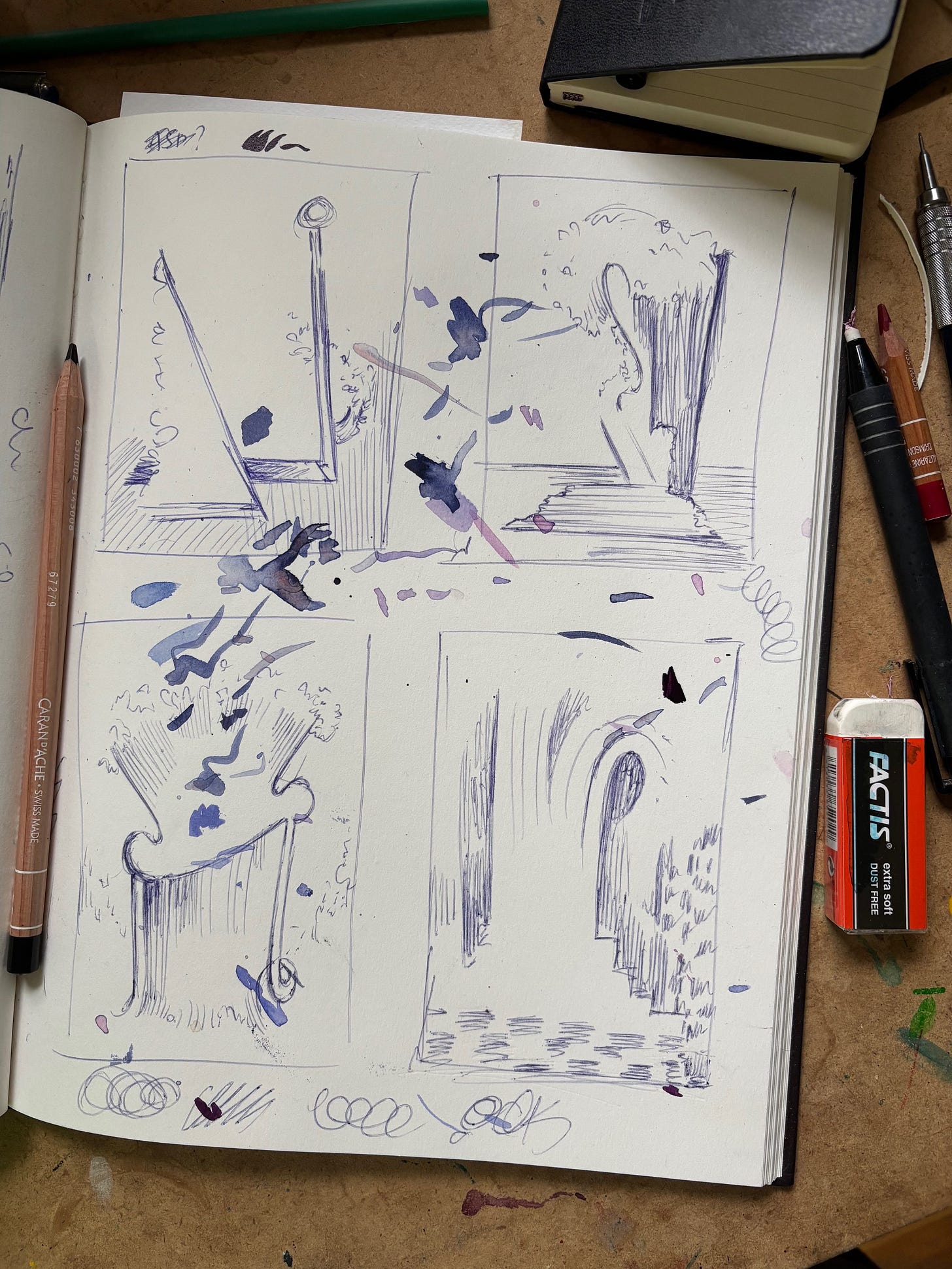
As for process—I start with fast ink washes. Just color, minimal form, enough to get me going. (You can see some in the photos.) I usually have a thumbnail sketch I work from, but not always. When I do, it’s really basic. The rest—value, texture, etc.—I find in the course of working. I work in transparent layers, be it ink or colored pencil. It’s slow and improvisational. And, because I find it all as I go, a piece can feel like a disaster until I’m 80% of the way through. Often, I think I’ve lost it, when I’m actually in the last mile.
MPM: Do I also see an influence of late 80’s or early 90’s textiles or graphics?
MG: You may! I don’t doubt it’s there, particularly since I grew up in that time—I’m 48. But I find I’m often blind to my own references, which is why it’s so nice to talk to other artists. A friend who saw the show told me I should have been making bands posters between ’66-’72.
MPM: In your show at Regards there is a group of smaller artworks titled 1-21. You’ve used the same materials yet these works feel more graphic, almost like engravings. Were these works done using a different process?
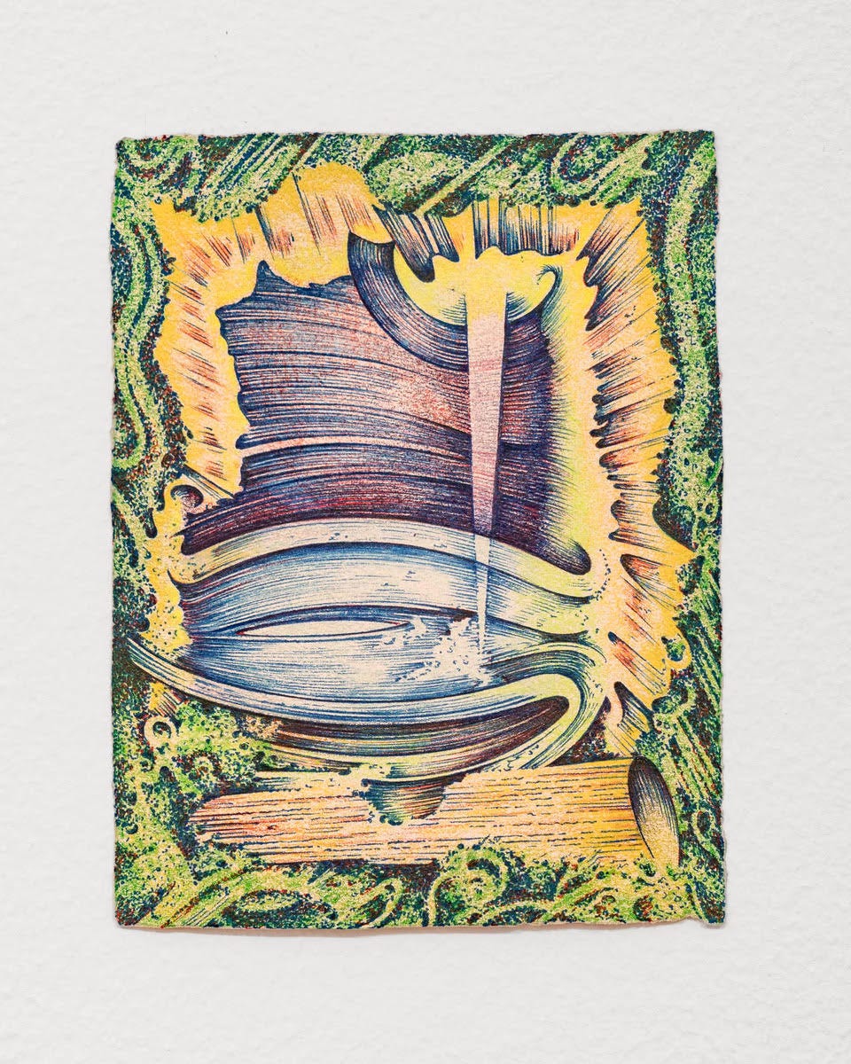
MG: Yes, I make these small pieces in a different way. I'm sitting down, with the piece on my lap instead of the wall. I plan nothing. I'm not in my studio. I’m on my couch, on an airplane, at a coffee shop. I use ink pen in these (Uniball), which I don’t use in my other work.
I don’t know if obsessive people are drawn to drawing or if drawing turns you into an obsessive person. Either way, that’s me. Adding this additional drawing practice has been a sneak move, a way to keep drawing when I can’t be in my studio for some reason. I’m on vacation with my family, but I’m still working! In other words, it might be a personality flaw. Though, I should add that I am an adult-onset type 1 diabetic. The mental and physical load is a lot, such that sitting with something small is frequently a way of being kind to myself.
Making these drawings is like eating candy, or playing with toy cars on the carpet. They look kind of indulgent, I think, with obsessive surfaces that I would find too rich at a larger scale. For example, you’ll see I have some pointillist tendencies with these. As for the more graphic element—you’re right, it's more pronounced here. Because of the pen, I’m sure. Anyway, to offer a metaphor: these drawings are as if I’ve caught a snake and put it in a box. Made it a little wonderland.
MPM: Can you talk a bit about the dialogue that’s established between the way the paper is prepared and cut allowing for raw irregular edges that are in contrast to the more refined and classical Baroque forms?
MG: I think I’ve retrained by brain, because at this point a rough edge makes more sense to me than a clean one. It’s a reminder of the surface being paper, as well as of the hand. In effect, the rough edge is a counterpoint to the precision of the drawing. I suspect any drawer can identify with this, the way your hand becomes like a pet with its own personality, its own tendencies, both welcome and maddening. I swear it's like being in a claw machine.
So, I try to complicate that. The way I cut (with my beloved, dull scissors) is different from the way I use a fat brush, is different from the way I use a colored pencil, and so on. I try to throw it all in, to create some interplay, tension, or surprise. I keep the many pin holes in the corners of my drawings for the same reason. I like how they look, but also like them as a mark of labor, a mini catalogue of days spent with a given piece of paper.
MPM: What do you best hope to communicate in your work?
MG: God, I don’t know. That I’ve lived a lot of days? That I should get out more? Sorry, I’m not giving you a real answer am I.
Megan Greene: Ides is currently on view at Regards through May 17th.


